My Cart
Your Cart 0

    Your cart is empty.

  • Total (Amount) ₹0.00
NCERT · Class 7 · Maths

Chapter 3: Data Handling

Practice each question, then open the answer or worked solution.

Exercise 3.3

Textbook page 72 · 6 questions
Q1Written answer

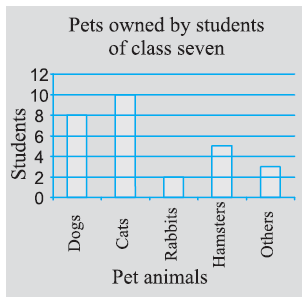
Use the bar graph (Fig 3.3) to answer the following questions.

(a) Which is the most popular pet? (b) How many students have dogs as a pet?
NCERT Solutions for Class 7 Maths Chapter 3 Data Handling Image 10

Show solutionHide solution
Worked solution

Solution:-

The bar graph represents the pets owned by the students.

(a) From the bar graph, the most popular pet is cat. It is owned by 10 students out of 12 students.

(b) From the bar graph, 8 students have dogs as a pet out of 12 students.
Q2Multiple choice

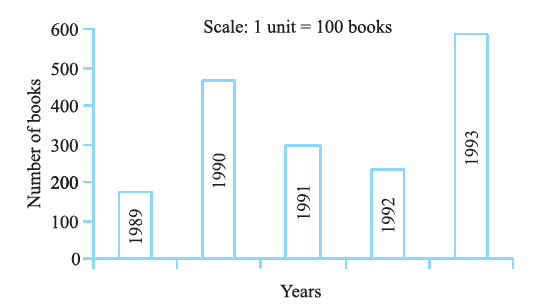
Read the bar graph (Fig 3.4), which shows the number of books sold by a bookstore during five consecutive years, and answer the following questions.

NCERT Solutions for Class 7 Maths Chapter 3 Data Handling Image 11

Show solutionHide solution
Worked solution

Solution:-

(i) By observing the bar graph,

175 books were sold in the year 1989.

475 books were sold in the year 1990.

225 books were sold in the year 1992.

(ii) By observing the bar graph,

475 books were sold in the year 1990.

225 books were sold in the year 1992.

(iii) By observing the bar graph,

In the years 1989 and 1992, the number of books sold was less than 250.

(iv) By observing the bar graph, we can conclude that

The number of books sold in the year 1989 is about 1 and ¾th part of 1 cm.

WKT, Scale is taken as 1 cm = 100 books

= 100 + (¾ × 100)

= 100 + (3 × 25)

= 100 + 75

= 175

Q3Written answer

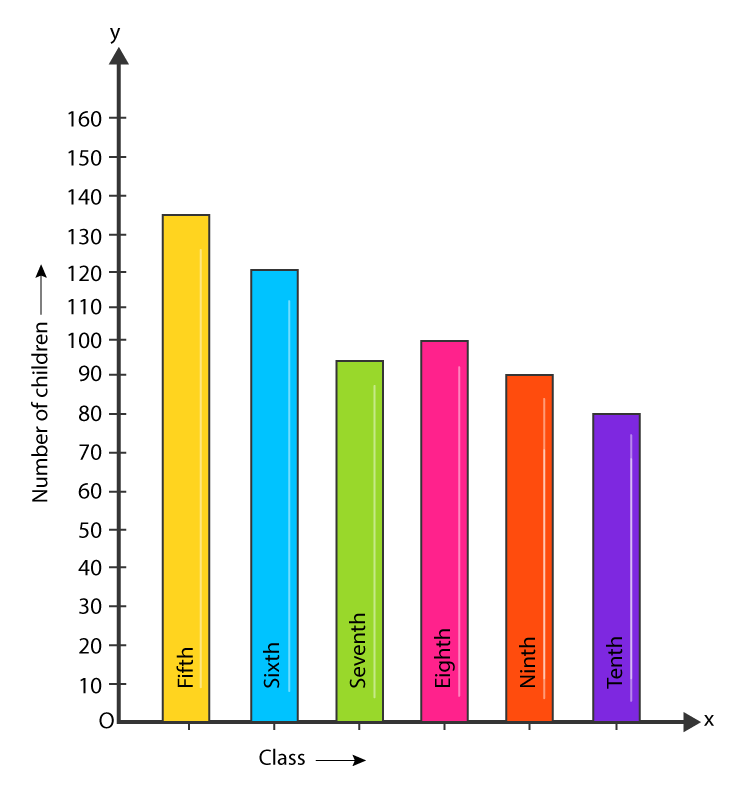
Number of children in six different classes is given below. Represent the data on a bar graph.

Class Fifth Sixth Seventh Eighth Ninth Tenth
Number of Children 135 120 95 100 90 80

(a) How would you choose a scale?

(b) Answer the following questions:

(i) Which class has the maximum number of children? And the minimum?

(ii) Find the ratio of students of Class six to the students of Class eight.

Show solutionHide solution
Worked solution

Solution:-

NCERT Solutions for Class 7 Maths Chapter 3 Data Handling Image 12

(a) We will take the scale as 1 unit = 10 children because we can represent a bigger and clear difference between the number of students in Class 7th and Class 9th.

(b) (i) Class 5th has the maximum number of children, i.e. 135, and Class 7th has the minimum number of children, i.e. 95.

(ii) The total number of students in Class 6th is 120, and the total number of students in Class 8th is 100.

Then,

The ratio between the number of students in Classes 6th and 8th,

= (120/100)

= 6/5

= 6: 5

Q4Written answer

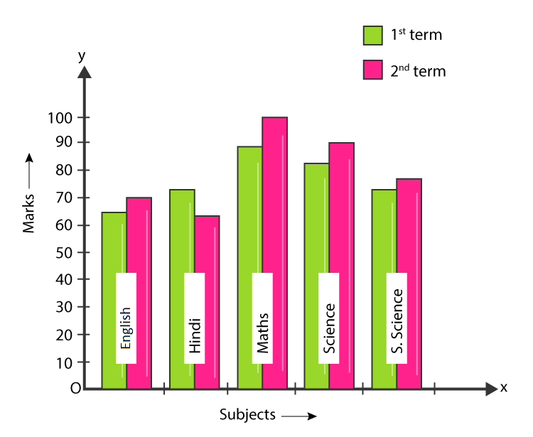
The performance of a student in the 1st Term and 2nd Term is given. Draw a double bar graph by choosing an appropriate scale and answer the following:

Subject English Hindi Maths Science S. Science
1st Term (M.M. 100) 67 72 88 81 73
2nd Term (M.M. 100) 70 65 95 85 75

(i) In which subject has the child improved his performance the most?

(ii) In which subject is the improvement the least?

(iii) Has the performance gone down in any subject?

Show solutionHide solution
Worked solution

Solution:-

NCERT Solutions for Class 7 Maths Chapter 3 Data Handling Image 13

(i) By observing the double bar graph, there was a maximum mark increase in the Maths subject. So, the child has improved his performance in Maths.

(ii) By observing the double bar graph, the improvement was the least in S. Science.

(iii) By observing the double bar graph, the performance in Hindi has gone down.

Q5Written answer

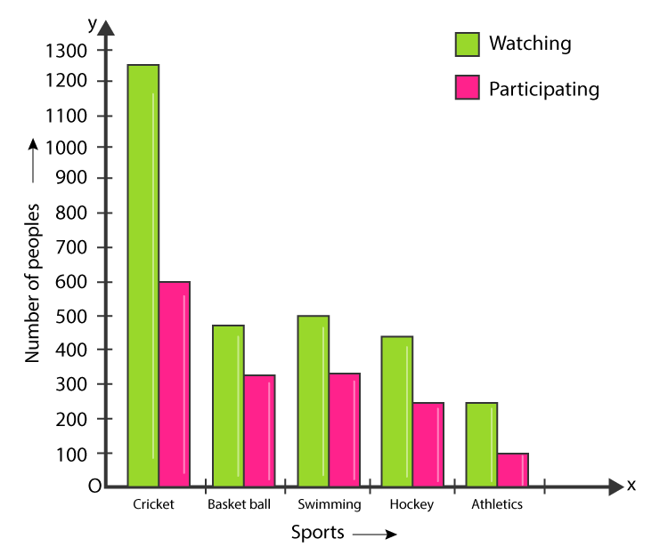
Consider this data collected from a survey of a colony.

Favourite Sport Cricket Basket Ball swimming Hockey Athletics
Watching 1240 470 510 430 250
Participating 620 320 320 250 105

(i) Draw a double bar graph choosing an appropriate scale.

What do you infer from the bar graph?

(ii) Which sport is most popular?

(iii) Which is more preferred, watching or participating in sports?

Show solutionHide solution
Worked solution

Solution:-

NCERT Solutions for Class 7 Maths Chapter 3 Data Handling Image 14

(i) The figure above is the double bar graph, which represents the people who prefer either watching or participating in different sports. By observing the double bar graph, we came to conclude that most people like watching and participating in cricket, while the least number of people like watching and participating in athletics.

(ii) By observing the double bar graph, we came to conclude that the people who like watching and participating in cricket are the tallest among all the bars. So, cricket is the most popular sport.

(iii) By observing the double bar graph, we came to conclude that watching sports has more preference, rather than participating in sports.

Q6Multiple choice

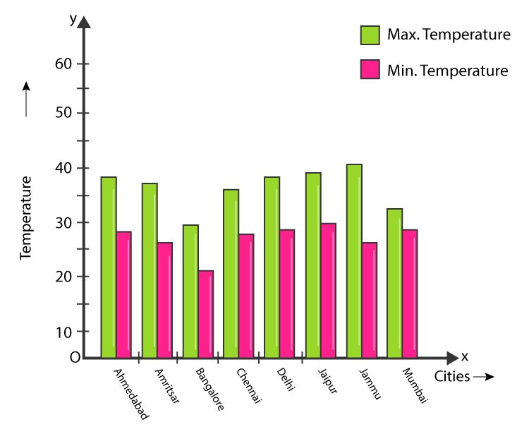
Take the data giving the minimum and the maximum temperature of various cities given in the beginning of this Chapter (Table 3.1). Plot a double bar graph using the data and answer the following:

Show solutionHide solution
Worked solution

Solution:-

NCERT Solutions for Class 7 Maths Chapter 3 Data Handling Image 15

(i) By observing the double bar graph, we came to conclude that Jammu has the largest difference in the minimum and maximum temperature on 20.6.2006.

(ii) By observing the double bar graph, we came to conclude that Jammu is the hottest city and Bangalore is the coldest city.

(iii) By observing the double bar graph, Bangalore and Jaipur, and Bangalore and Ahmedabad, we can see that for Bangalore, the maximum temperature was 28oC, while the minimum temperature of both Ahmadabad and Jaipur was 29oC.

(iv) By observing the double bar graph, Mumbai has the least difference between its minimum and maximum temperature.